In Depot Project #07 - Finishing touches

Making Of / 01 August 2021

After finishing texturing the assets and assigning all those textures to material instances, the majority of work is done. The progress became more visible visually, but still couple of steps left. These can help to add more details, to finalize the look and feel of the scene and to add to the storytelling. Because one of my goals was to focus on storytelling, lighting and composition these final steps are as important as any other steps were done so far.


10. Creating and adding decals

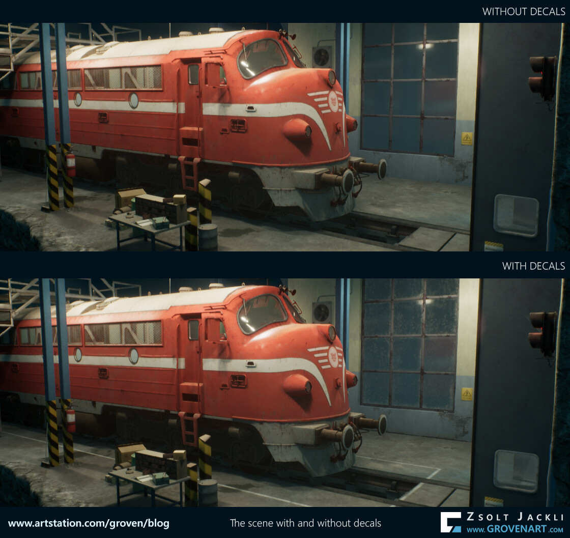
Decals are textures with the function to add more detail to the scene and break up the repetition. In Unreal you can use the decal actor to place them one by one but I went for another solution. I used mesh decals. I built planes, placed them in the scene and textured them. Using decals I could:  

  • add details to the edges and soften them near the windows, the doorframe and the tracks. Those were really sharp due to the fact I build the mesh with modular approach and beveling the edges would have caused visual bugs I wanted to avoid
  • add cracks, marks, cobwebs, leaking, dirt
  • add dirt to the glass surfaces


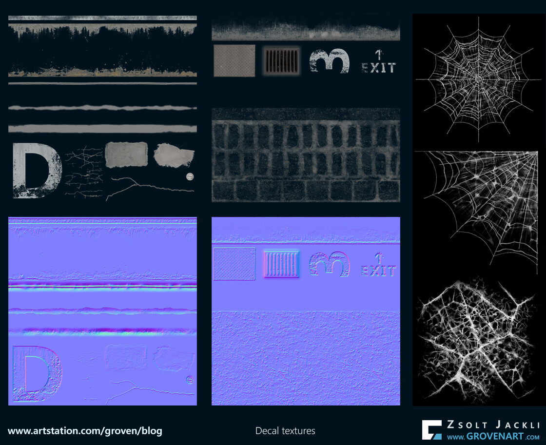
Because I used mesh decals I could optimize the UV and texture space they use. I ended up using three textures for all of them. To speed up the texturing process some of the textures were picked from textures.com and edited in Photoshop. The cobwebs were borrowed from a refrigerator asset made by Jonjo Hemmes which became available for free on Artstation a while ago. The rest like the edge details or the dirt on the windows were made in Substance Designer by me.

Important to mention that decals are great additions to a scene but they have a performance cost because it uses a translucent material with opacity texture. Also positioning and figuring out how big the decals should be that it look always good is also tricky. They were cases when the camera was a bit further away from the scene and the decals which were behind the wall got rendered on top of the wall mesh. The reason behind this in which order the engine renders them and the other objects in the scene. I had to play around with the size and position of the decals and in some cases I also had to delete some them to get rid of this a visual bug. I wouldn`t say I found a perfect solution for this, but it helped a lot. There is an another visual bug I run into which is easier to solve then the one I just mentioned. It happened the decals were rendered on top of an object no matter how close or far the camera was from the mesh. By default in every mesh the Receives decals option is enabled. After selecting the mesh in the Detail panel disabling this option can help to solve this issue.


11. Post processing

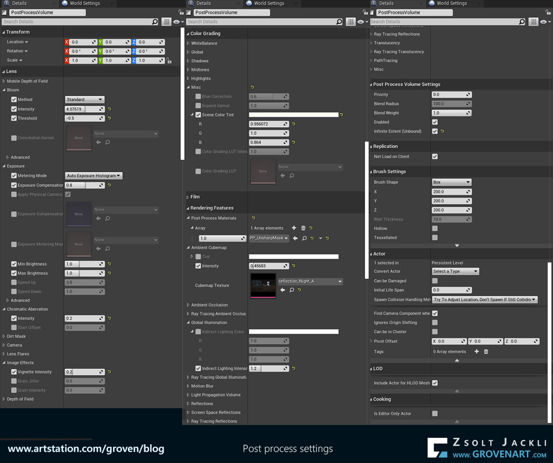
After the lighting, all materials, textures and decals were in place I started to fine tune the post process volume to get the look and feel I had in mind for the diorama. The post process can have a huge impact on the overall scene, so I tried to avoid to do extreme tweaking in its settings. Instead I did subtle adjustments here and there and building the effects on top of each other to get what I was aiming for.

As you can see I adjusted only a few settings focusing on what I really need. Bloom, Exposure, Chromatic Aberration, Vignette effect, Scene color tint. It really depends on the scene but I saw these settings are often adjusted in many cases. I didn`t even use the  LUT, a powerful post process effect because after couple of tests I realized the scene doesn`t need it. But there are three settings which proved to be really helpful next to the ones mentioned above. The scene itself is pretty dark so I needed to lighten it up a little bit more to make the details pop up and have something as reflection for metal surfaces. Playing around with the intensity of the Global illumination and adding an Ambient Cubemap (borrowed from the King Wash Landromat scene made by Clinton Crumpler) did the trick. The third settings  I played with was the post process sharpening effect. In some cases the renders made in Unreal can be a bit washed out by default resulting loss of details. To get the details back adding this sharpening filter can improve the renders.


12. Making renders, videos

As one of my goal was to focus more on composition I set up couple of cameras at the very beginning of the project to see my progress and check things from different camera views. I used different composition techniques but the most frequently used one was the Rule of Thirds. My aim was to have a simple approach and set up with an object in focus while I show the diorama from different angles. Combination of the camera settings and placement adjustment along with the set dressing led to the final shots. As I progressed with the scene I added more cameras so at the end I could chose which camera I want to get the render from.
For the videos I used the Camera rig rail system in Unreal and recorded them in Level Sequencer. I edited and labeled the videos in Shotcut, a free video editing tool. 

Check out the final renders and videos here.


13. Publication 

The project is done, but still there is one more final step. Every step I`ve talked about so far was important for a reason or two. This step is important to showcase your knowledge and ideas and get a reaction from others how they feel about what you created.  It takes some time to prepare the texts, images for different sites but needless to say  publishing your work can bring opportunities or encounters in your way. So even though that it is not really part of the creative process like figuring out how to texture different objects that they harmonize in the scene, but it does worth it. 


Closing words

Thank you for reading my posts about how this diorama was made. What I wrote down is my experience how I managed to do this project from start to finish.  It depends on the size of the project and also varies by people how much time it takes to finish a project like this. For me it was an interesting, long and challenging journey. Along the way getting feedback from the community helped me to make the next step. My special thanks goes to Ryan Benno who at the end of the project gave me his support and I could finish it.
The workflow I followed and the steps I took to create this diorama is very similar how a project like this gets done in the industry. I`ve seen other artists followed similar steps but in every case their approach was also slightly different. I hope you found something new while reading my posts and was helpful in your project.

Stay safe!

In Depot Project #06 - One material for multiple assets

Making Of / 14 July 2021

It has been a while. Many things happened in the last 2 months on my side and couldn`t really find the time to continue the blog. Sorry for keep you waiting, but finally here is the next post. At the end of the previous post I gave a sneak peak of one of the materials I made for this scene. If you think I`m going to talk about materials, then you`re right. So without further due let`s dive into this topic!

When it comes to material creation the first question you should answer is "What kind of materials do I need to create for this particular project I`m working on?" The answer is: it depends on the project, on your goals and what you need the material for. With other words, the material should be aligned with what you are aiming for, therefore it is capable of fulfilling its function in the given scenario by giving the expected results. If you identify its function early on you can make a plan based on this and execute it. For instance I wanted to use vertex paint material for large surfaces such as the wall and the floor. For the wall I wanted to introduce a secondary color for the paint without using any textures. But later I came up with the idea that I also want to add puddles on the floor too using the vertex paint material. I had to think about it how to pull this off because puddles on the wall does not look believable and secondary color stipes on the floor looks also funny. I needed the material to be really flexible and be able to switch between materials or replace them if it was needed. So at the end after lot of try and error I managed to create a master material in which I blended together 4 different materials. I built in a switch to be able to swap the last material to water material. For the secondary paint I used Tor Frick`s approach with a slight modification to make it fit into the system. To make the material flexibility and reusable I exposed all the parameters I needed later for tweaking. I created a Material Instance of the Master Material and applied it to the surface and modify, tweak the parameters for my needs.
There are many good tutorials about how to make a vertex paint material in Unreal. I also showed in this post how my vertex paint material works in action. Therefore I`d avoid talking in more details about this type of materials. Instead I`m going to talk about how to create a  material which can be used for almost all the assets in my scene.

Creating a material is a process itself as my brief explanation above shows. Basically you build a system. Therefore there are steps and certain logic you have to follow to build its structure. I`d advise not to compromise the system you want to build just for the sake of saving time. Later it can get really confusing when you have to deal with many assets like I did in this project. If you come up with a plan how the material should work, what is its purpose and you follow it, test it and iterate it it will give you an organized, efficient material at the end with a lot of flexibility and the possibility to be able to reuse it later in another project.
As I mentioned before it is important to test your textures and set up a basic material early on. As a first step better to keep the initial material setup rather simple (you just plug in the basic textures and nothing else). The reasons are: 1) you might not have a clear idea what functions you really want to add to the material at the beginning, 2) it is easier to iterate and add more functions to a simple setup than to a complex one.
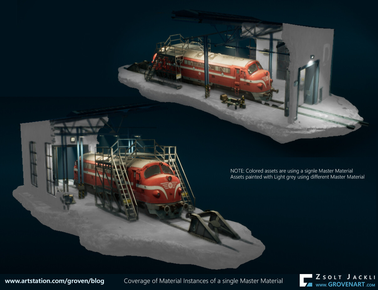
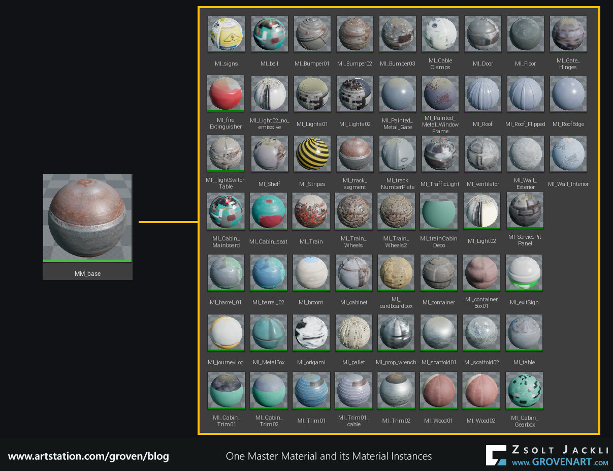
Like in the case of the vertex paint material in this case as well I had to think about what the material should be capable of. To challenge myself I came up with the idea to create a master material which fits for all the assets in the scene. It was a bold plan. To build in all the functions I came up with in the material without making it too complicated was a tough nut to crack. At the end I could apply material instances referencing a single master material to 95% of the assets. The missing 5% (glass, vegetation, decals, vfx materials) needed their own master material mainly because they had to have different shading models (two sided foliage ) or blend modes (translucent) within the material. 


Advantage using this approach that a Master material can have as many Material Instances as you want. If you adjust something in the Master Material it will be applied to all its Material Instances. The picture below shows the number of Material Instances I used to get the coverage seen on the picture above.


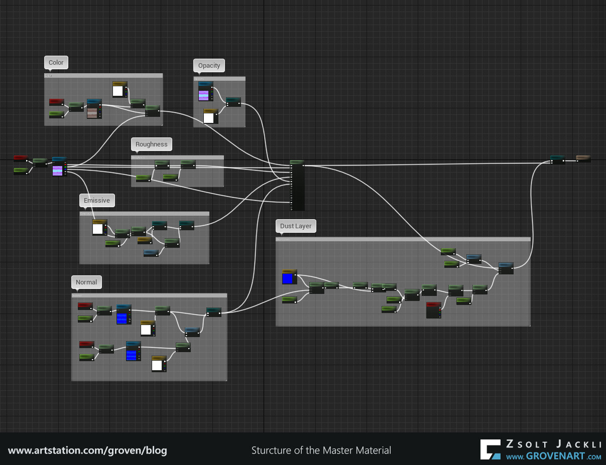
As I said earlier you build a system and every system has a structure and follows a certain logic. The base of the structure was the albedo, roughness and normal textures because I used PBR workflow. To reach my goal I also followed a certain logic. Namely if each of every asset is textured the same way the same system can be applied on them. Simple, isn`t it? Therefore the way you create a material it also depends on how you approach texturing. The system - as the picture shows below- relies on the RMOE (Roughness, Metalness, AO, Emissive) texture. If I didn`t combine these together in one texture the structure would look like a bit different. To have a clean and organized material  creating a group for each textures and adding parameters to the group was the way to go.

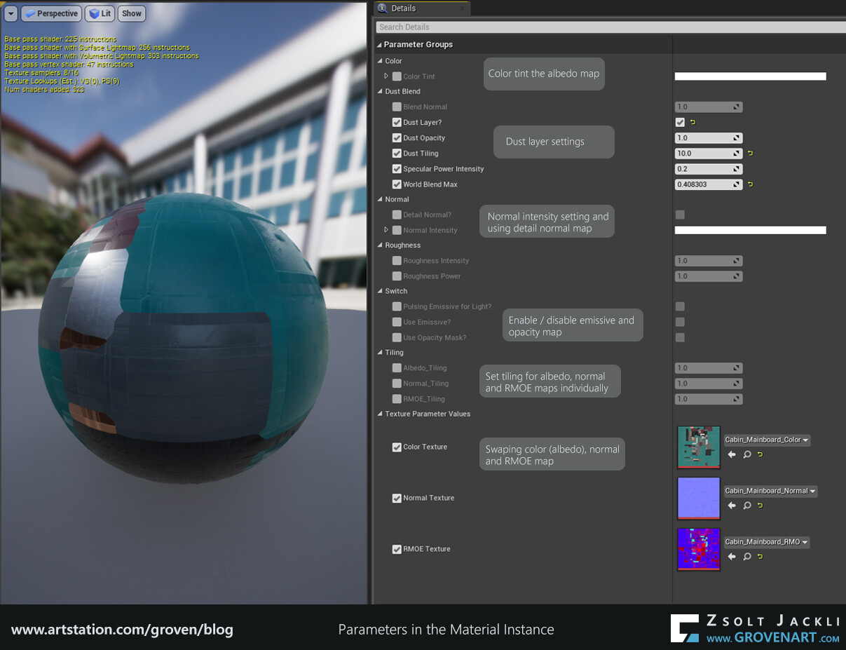
But how to decide what function or parameter add to each groups? Checking your references again or the story you want to tell with the scene, getting feedbacks from other artists can give you new ideas. Adding color tint, adjusting tiling or intensity, adding detailed normal map on top of the normal map are popular picks to enhance the material. I also added these to the master material and came handy in some cases. Furthermore I added Opacity texture so the assets using opacity (p.e. broom) can use this material. I named everything and organized them in groups so in the Material Instance window easy to understand the function of the parameter and what has effect on what.


But this was not enough. Looking at my scene the whole felt static. There was no movement at all. Initially I had in mind to animate the ventilator and the grass (which I did later), but these are too small and hard to notice. I wanted to add something which is more noticeable. To challenge myself (again) I wanted to add something driven by the master material. This way I could enable it or disable it in any material instances of any assets whenever I needed them. At the end I added a flickering light and a dust layer to the master material.

The scene had a night lighting scenario and according to the story I came up with the train was waiting in an old depot. After researching how to make a randomized flickering effect I created a material function for this purpose and linked it to the master material. I put the flickering light outside and left all the lights on inside the depot. This way I could create a contrast in the lighting and in the mood because inside feels safe (lights are on) and outside is uncertain, uncharted (flickering light and dark). Here is the flickering light in action.
Dust is a very good visual tool to emphasize the pass of time and the fact that no one was around for a while. I did want to avoid to paint a dust layer manually for each of every asset because it would have taken too much time. Instead I researched the topic and found a way to use world aligned texture in a material function which will be projected on top of  the object regardless how the object rotated. I combined  this with the base textures inside the master material. If you make something like this for the first time it can be quite intimating and hard to digest. But there is a really good tutorial explaining how to create this.


Stay safe and see you next time!

In Depot Project #05 - Details in the texture

Making Of / 09 May 2021

Lately I was busy, so this post comes with some delay. So without further due let me share with you the next steps.

In my previous post I talked about how I generally approach texturing and also briefly touched the topic of materials. Now let`s dive into these a bit more.
When you do a project in a game engine and work with a workflow like PBR it is really important to test the textures and setup a basic material in the engine as soon as possible. In my projects usually this is why I have a First texture pass, master material setup in game engine phase. When I do texturing I tweak the textures and the lighting together and try to synchronize them so they can work together. For the sake of project tracking I separated these in different phases but they are connected. So they have to be handled together.
This workflow is all about lighting and how the materials react to the light. If you do not get the basics right from the beginning the whole thing can easily fall apart and you can not create a certain look (meaning the metal surface feels like a metal surface) or create believable materials. For instance it can happen that  for the first try the textures on the object looks too dark. A common trap is that you crank up the light intensity to get more light and make the object look brighter. But this can result that your whole scene will get too much exposure and you get a blown out image. Instead, check if:

  • the color profile setup in the texturing software matches with the engine color profile setup
  • the value of the color isn`t it too dark
  • the roughness has the right values for the material you want to create and has enough variation

In most cases this can solve the issue but of course small tweaking in the lighting itself might be needed too.


9. Second texture pass + Second lighting pass in game engine

After the first pass I take a short break to clear up my mind. Looking at the same thing over and over again can cause you miss something. So I after the break I look at the whole scene again to identify what has to be changed or what is wrong. Based on my observations I did the following changes:

  • I changed some lighting setup. The inverse falloff was disabled so I enabled it, tweaked the settings of the lights to get more soft shadows and a nice vertical gradient in lighting
  • I was not really happy with the roof and roof structure so I did more studies (checking images, doing sketches) and based on that redid it 
  • I repositioned some of the objects so they look better placed from camera view
  • I added some details to models and more props like bolts on the table or cables on the wall
  • I added more division to the window frame to emphasize its scale
  • Hanging light was out of scale, so I redid the whole model
  • I made some of the color textures brighter


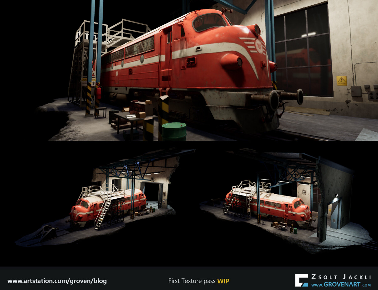
After all this I moved to do the second texture and lighting pass. In this pass I tweaked lighting, camera, materials and texture settings to make them harmonize with each other. I also started to play with the postprocess effects, mainly because how I set up the emissive. It requires bloom to be enabled to make it work properly. Image below shows the progress from first to second texture and lighting pass:


When you texture an asset you have to take into consideration not only the scale of the model but its function, where it is placed in the scene and what story you want to tell with it. All these together should be represented by the texture. In the followings I share my general approach for texturing an asset.


This asset I used as an example above looks rather clean. I mean there is not too much dirt or dust on it. The reason for this is I add a dust layer  with the material in the engine.


Stay safe! See you next time!
In Depot Project #04 - Let`s start texturing

Making Of / 24 March 2021

Finally after all the preparations and investigation let`s move to the next phase of the project which is:

8. First texture pass, master material setup in game engine

In this stage my goal is to create the base of the textures, create materials with parameters to be able tweak those in the engine real time and a basic look for the whole scene.
In my previous posts I shared screenshots of the scene. The scene might seem to be simple (it is in a way) but it is made of many objects. When I have to deal with more than 100 assets texturing can be really time-consuming. So here is how I find solution to speed up my workflow without sacrificing the quality:


  • Track the progress of each asset

As I mentioned in my first post the project tracking file contains the list of assets. As you can see it on the image below it provides information about the asset creation process from start to finish. During the process of dealing with many assets it is easy to get lost. But this way I know how far I got with each asset and how much work still has to be done. It also contains additional information about which assets are using the same texture or how many pieces they were broken into to keep the texel density of the object.


  • Know and set up the software you use

There are many ways to texture an asset. Due to the large number of assets I decided at the beginning of the project what software I use for what steps. For modeling 3dsMax, for creating a high poly version of the asset 3dsMax or Zbrush, for baking and texturing Substance Painter and/or Substance Designer. With each asset I follow the same steps and in each software I have my basic setup (hotkey, export template, smart material, etc.) to speed up my workflow. This way I use each software what it is best for to get the result I want.

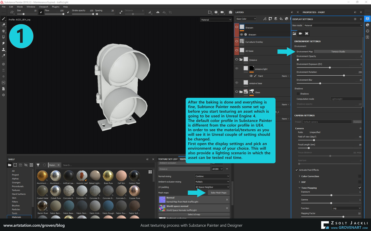
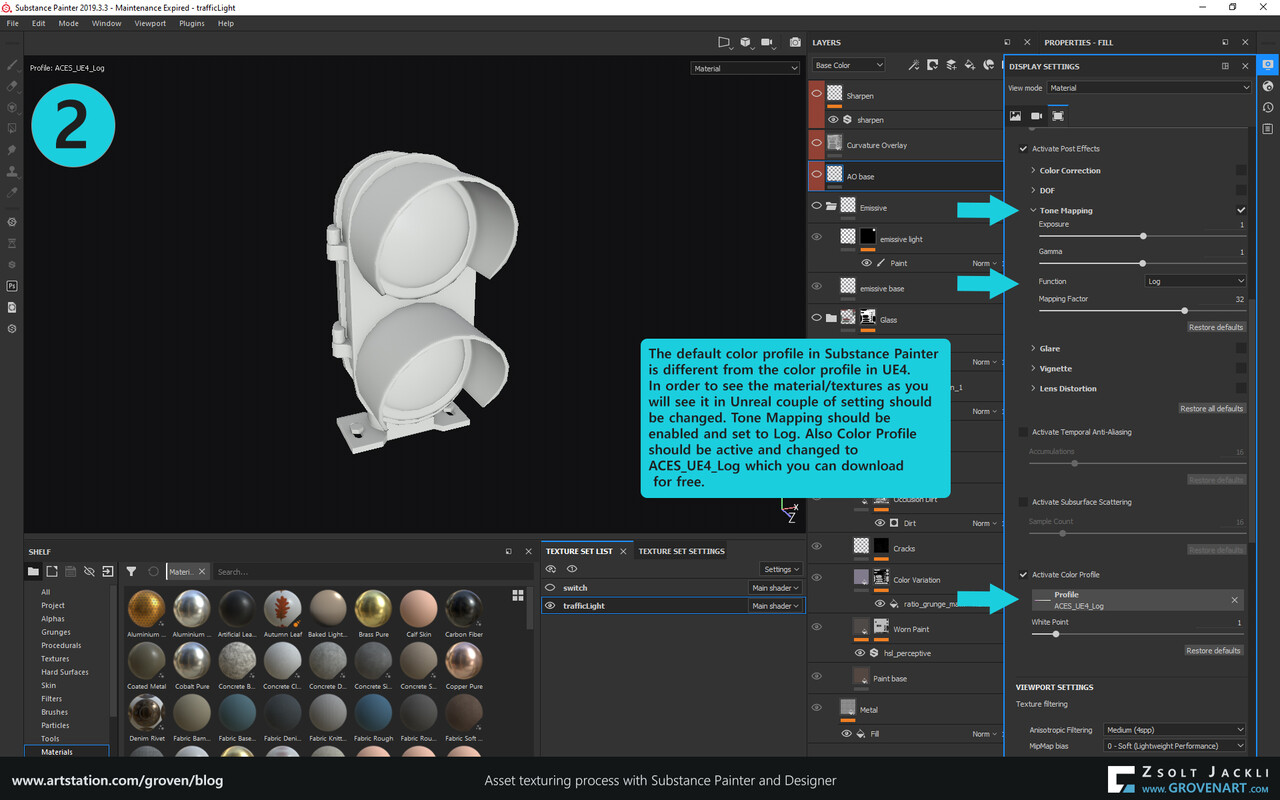
Being familiar with the software is an important factor. For instance Substance Painter is using a different color space than Unreal by default. Therefore before I start texturing I have to set up the file properly in Painter to see how the asset would look in Unreal. If I hadn`t have known this then I would have got  a different result from what I expected and would have had to spend time to investigate it.


  • Put each asset in a texture category

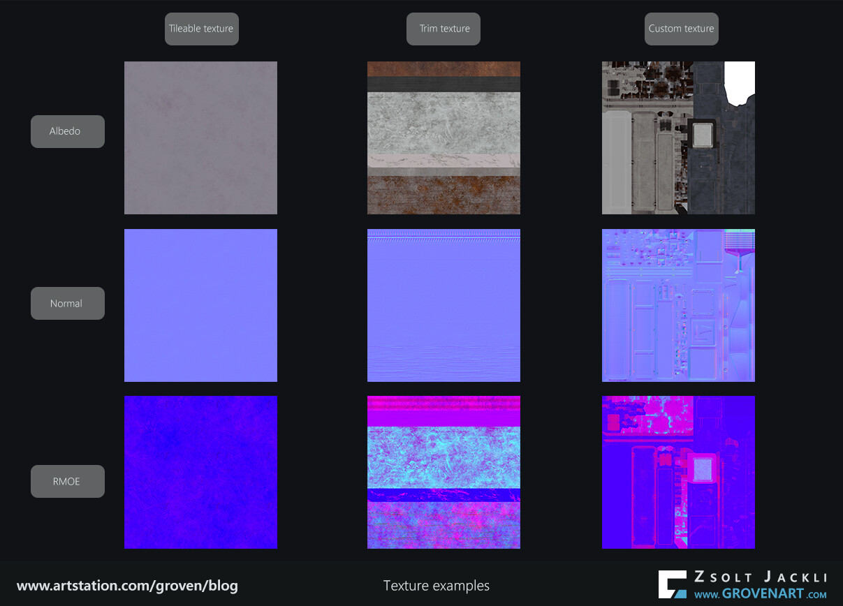
I put the textures into 4 categories. Tileable, trim, custom and decal textures.  Each asset is different and when I did the UVs of them I was already thinking about how I want to texture them and which category they would fit in to save time. For tileable, trim and custom texture see the examples on the image below.
For instance there are big surfaces in the scene like the wall, the ground or the roof. For these the tileable textures are the best choice because they can cover them quickly and mixing them can break up the repetitiveness. Objects which can tile in one direction like the cable, the drain pipe or the reinforcement rod can use a trim texture to save texture space and reduce the number of textures I have to create.  When the object is unique like the bumper or the hanging light and requires its own texture to be created then the next option is creating a custom texture for them. Finally the decals can help to break up big surfaces or the repetitiveness of the tileable textures. Their function is more like adding detail so at this point I do not have them yet.
Of course one object is not limited to use only one type of texture. In some cases it turned out that it is more efficient (and faster) to texture an asset using both trim and tileable texture instead of a single custom texture.


  • Study and understand what you`re doing

Because I go for a PBR workflow not only I have to understand how PBR works but how to create the textures fitting into this workflow. Looking at references and analyzing how the textures and materials should be done is essential.
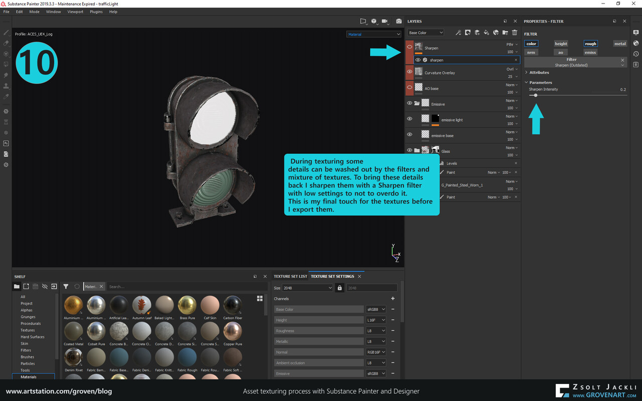
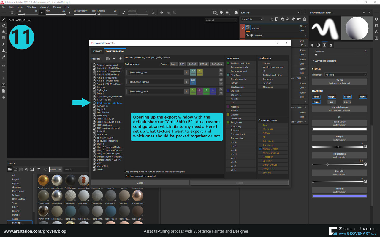
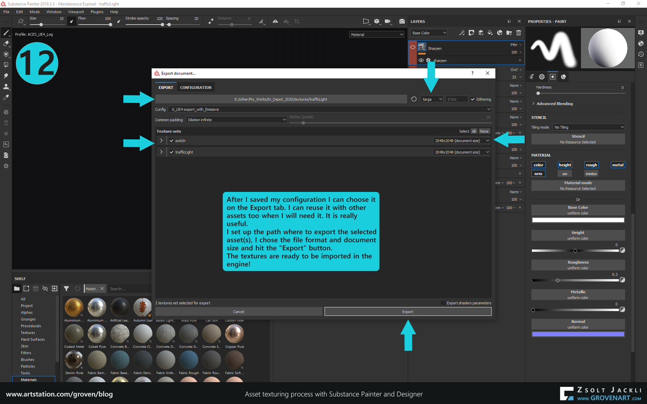
In this project everything needs to have an Albedo (color), Normal, RMOE (Roughness, Metalness, AO, Emissive) texture. When it is needed I make an Opacity texture separately. The roughness, metalness and AO are grayscale textures. In order to to save texture space and simplify the material I build in Unreal (meaning using less texture sampler) I combine them in one texture by placing the roughness in the red, the metalness in the green and the AO texture in the blue channel of the image. The alpha channel of the image is used by the Emissive texture.


  • Use the software what it is best for

Each software has powerful features which can help to get the texturing done faster.
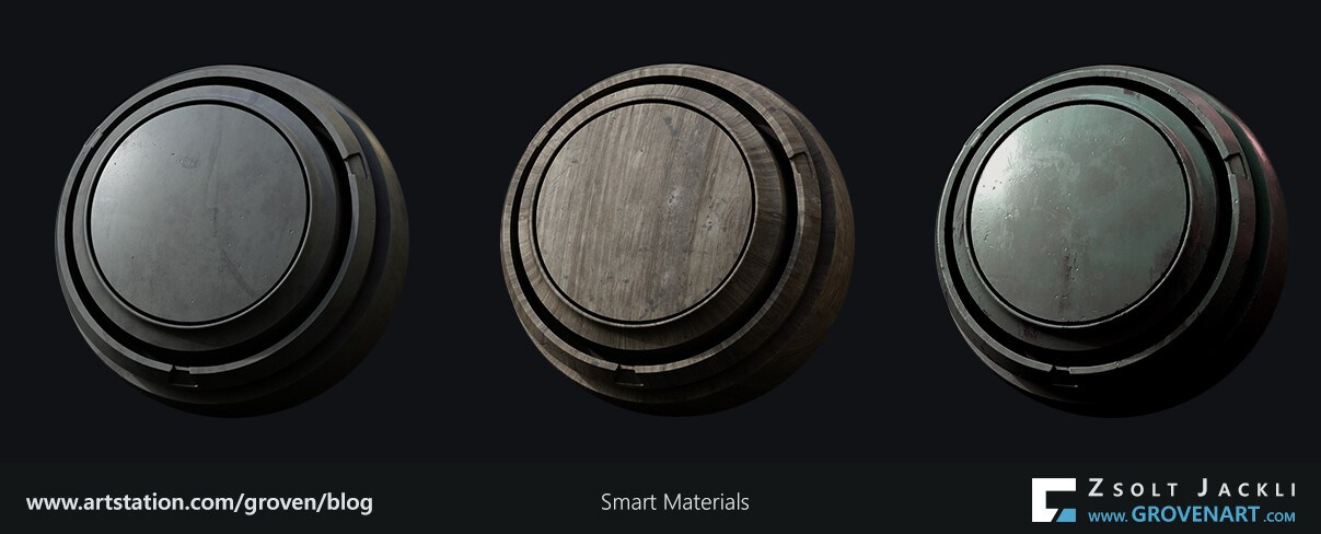
For instance the most used material in this project is painted metal, wood and plastic. So I created a Smart material in Substance Painter for each of them. When I create the base texture for an asset using one of these materials I just have to drop the material on the asset and adjust the settings of the layers to get a result which works as a base. This is a good starting point and enough for now. Tweaking, adjusting adding more details will be done in the second pass.


Let`s talk about the master material setup briefly.
Master material in Unreal are the materials containing all the setups, settings you want to be able to use the material for. For instance you can turn on and off a flickering effect with one click or adding a dust layer on top of your object. If parameters are exposed in the master material you can create an instance of that material (called Material Instance), assign it to a mesh and tweak the parameters fitting to that mesh.  The power of Material Instances is you can create as many as you want and each can be tweaked separately not effecting each other. You have to create the master material only once and the Material Instances will reference it all the time because of the live connection between the two. I will show an example later.
To push this to the next level. Materials combined with vertex painting is a really powerful tool and gives more flexibility to create basically whatever you want. With other words, they give a lot of freedom to be able to mix together different materials. The video below demonstrates this tool in action. I blend together 4 different tileable materials. On top of that I introduce a secondary color layer which height I can controlled in the material instance.


With these solutions I managed to cover the first texture pass of most of the assets relatively quickly. As the images below shows it starts to take shape but still there is lot to be done. 

Stay safe and see you next time!

In Depot Project #03 - Take time to investigate

Making Of / 24 February 2021

 Before I start talking about my texturing process there is a topic I`d like to dedicate this post to. The topic is as you could read in the title: Take time to investigate.
During a personal project or professional work unexpected challenges can emerge to test our us. When you estimate the time to complete an asset or an environment from start to finish this should be calculated in because you need some time to investigate it. In some cases it can be really annoying for instance due to the time constraint you have. It depends on the issue it can take from 5 minutes to couple of days. But in return you gain knowledge. This is one of the reasons why I like doing personal projects which are a bit more flexible timewise. On a long run the time spent on investigating an issue can be helpful and save time later. 

 In my  my second post I talked about how I used blueprints to group multiple meshes together and keep the texel density of big assets. I mentioned the issue of casting shadow of a large actor (in my case this was the floor) and after adding 40 meshes the blueprint started to cause errors. These really bugged me and I looked into them to find out why these issues arose. So far I`ve used dynamic lighting in Unreal but have had a basic knowledge how static lighting works. This is the very first time I use baked lighting for a more complex project. Also same goes for blueprints. So I took time to investigate these issues. I found useful information scattered across multiple forums but I also did a lot of testing, adjusting models and rebuilding blueprints to find the solution. Below I  summarize all my findings to have everything in one place: 

 1) Set mesh mobility to static and check nothing is broken

1) Set mesh mobility to Static and check nothing is broken 

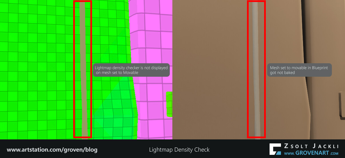
The reason was very simple why I got the errors at the first place. For baked lighting the mobility of my meshes should be set to Static. But in the blueprints they were set to movable. When you add a mesh to the scene their mobility set to static by default. But if you add a mesh to a blueprint its mobility set to movable by default. If the mesh is set to movable it won`t be baked by Lightmass. So this should be corrected.
The easiest way to check if the mesh is set to static is to check its properties. But if you switch to lightmap density view in Unreal (Default key: Alt+0) and the checker map is displayed on the mesh then its mobility set to static. But if you get a solid color like in the image below that indicates the mesh was not set to static so Lightmass will not bake it. This is a strong visual feedback and I use this heavily due to the fact that in my scene I have more than hundred assets.
When I created the cable blueprint drag and dropped a Scene component over the Default Scene Component to get rid of the white ball. I did not want to have it visible when I place the cable in the scene. Because the cable mesh is attached to a spline in this case the mobility of the Scene component should be changed and not the mobility of the spline. However after setting it to Static I constantly got a solid color in the lightmap density view and the cable did not get baked. It seemed like Lightmass totally ignores the mobility of the Scene component. I checked different forums but could not find any answers to my issue, so I checked exsiting blueprints in other scenes to find a hint. This is how I came across the tooltips in Blueprints. All the components in Blueprints have a tooltip if you hover over them with the mouse. The corrupted Scene Component I had did not have any at all. During the swapping process the Blueprint might got corrupted. This is how I found out my Blueprint was broken. After remaking the cable Blueprint and placing the cable again in the scene it showed up in the Lightmap density view and got baked properly.


 2) Dealing with static mesh having light seams

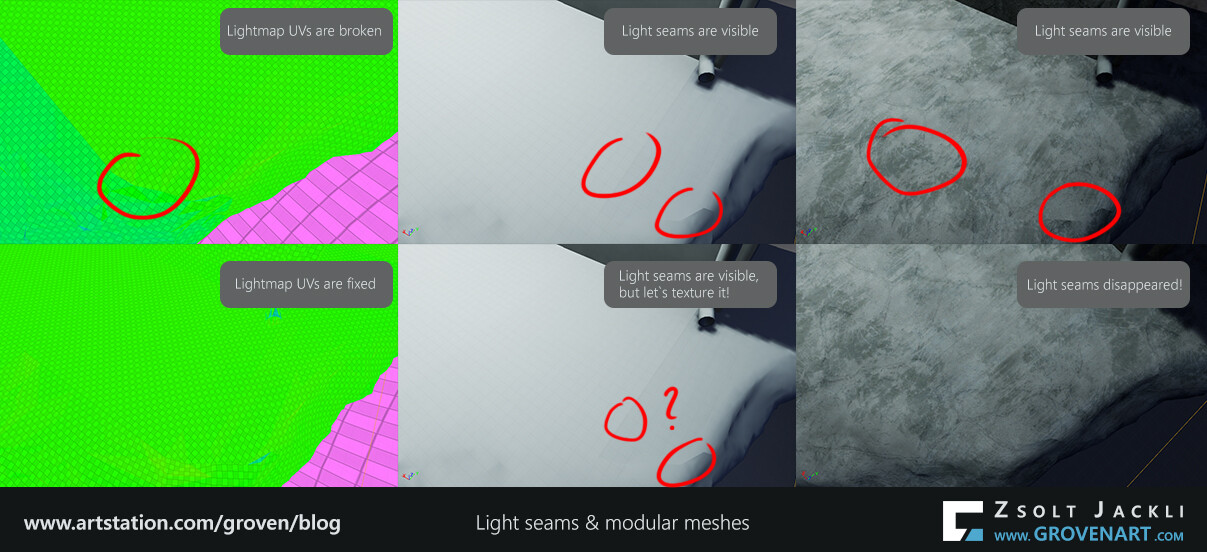
If every mesh set to Static and a light bake test can reveal the light seams which can be caused by:

  • Not enough padding (space) between UV shells on the lightmap channel (usually the second UV channel)
  • Overlapping polygons on the lightmap channel
  • Unweld or floating vertices in the mesh causing UV issues

If everything set up correctly but still got light seams it is worth to check if there are inverted UVs. If there are flip them (in some cases this was the solution for me to get rid of the light seam)

For modular pieces the UVs on the lightmap channel should be snapped to the grid and have the same texel density to get rid of the seams. Because of this I had to break the big decimated bottom part of the floor into several meshes. Also it is worth to double check if the size of the modular meshes is correct, meaning no floating, lonely vertices and the different pieces snap perfectly together.


 3) Adjust the Lightmass settings and/or Bake quality

It can happen that after making adjustments on the UVs of the lightmap channel but the light seams still appear. They won`t go away in every case no matter how perfect the set up is. The engine and its algorithms play a big role in how the baked lighting is computed. Luckily there is still an option that can help to get rid of the seams. Adjusting the Lightmass settings by increasing the Indirect Lighting Quality and decreasing the Indirect Lighting Smoothness can help to smooth out the seams to make them disappear (Note: This can increase the baking time). Also in some cases changing from Preview to Medium quality bake can also help.


4) Check the baked mesh with a tileable texture

If everything goes well light seams are gone or there are in places where hard to notice them. But I run into a case (see the image below) where I got the light seams despite of the steps explained above. After double checking my meshes and UVs I applied a tileable texture on the meshes Just for test purposes. They will be textured anyway, so I thought it is good to check them with a texture. For my surprise the seams were not visible anymore (Note: If you apply a texture on modular pieces do not forget to set up the texture channel, usually the first UV channel, properly to not to get texture seams).


I hope these findings help those who new to baked lighting in Unreal.


Stay safe and see you next time!

In Depot Project #02 - Pushing vertices

Making Of / 24 January 2021

I hope you enjoyed reading the introduction part of this project and you are ready continue to learn what I am about to share with you today. 

Continuing where I left off last time the next step based on the project structure I made is only two words:


7. Refine blockout

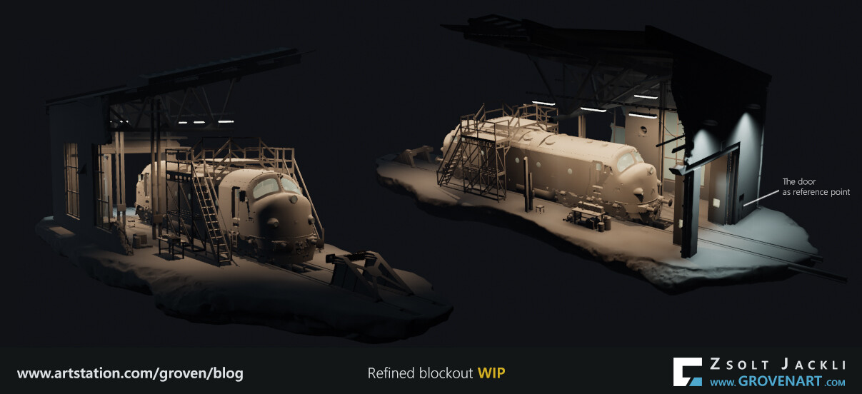
This step covers way more than these two words say but for me they describe pretty well what I have to do here. This process can be really time consuming and contains a lot of things so I usually divide it to two major tasks and those tasks have subtasks. So when I say refine blockout I mean the followings:


TASK 1:

 Add more details to the blockout: Basically I revisit what I have created so far and adjust their shapes if necessary and/or add more elements helping to communicate the story, functionality or the scale of the object. For instance I added a door to one of the walls. Everybody has a basic understanding how big a door is. It is used every day and pretty simple how it works. It was designed to separate and connect spaces and be able to open it and go through the hole it covers if you need to. For 3D artists and also for the viewer a door can be a reference point. It helps to communicate the size of the assets in an environment where there are no characters. Furthermore the relation between assets in terms of scale can be understood better.


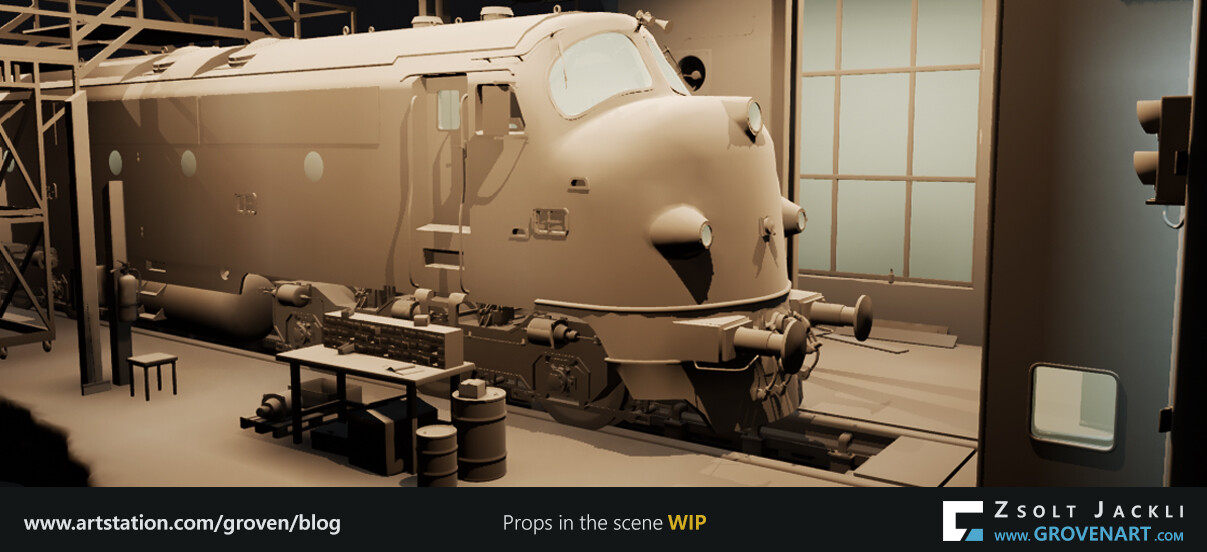
 Populate the scene with props: As you could see in the previous post I placed only the most important elements to build up the scene, but I did not placed any props. The reasons for this are 1) I didn`t need them for the first lighting pass, 2) I simply did not have them at that time.:) When I collected references I did it for the props as well. I looked for those in particular which could help to tell the story I have in mind. After revisiting old ones from my own asset collection and creating new ones which were missing for this project I started to place them based on the cameras in the scene. I tried to come up with an interesting mini dioramas within the support the story. Among the props there are tables and stools. These are simple objects. In many cases they do not even get to much attention by the viewer but they have an important role. They serve the same purpose as the door mentioned above. This way not only the exterior part but the interior part of the scene have scale references that anybody can relate to.


TASK 2:

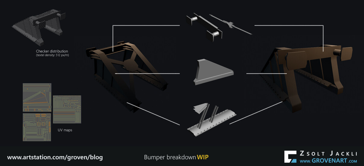
 Pushing vertices:  After I am happy with the results I have so far I start  "pushing vertices".  When I go for a workflow where I have to bake maps my models are more like midpoly models rather than low poly models at this stage. I use this approach because it is faster to create the low and high poly version of the objects using a midpoly model than making everything from scratch. I did UV the assets for the first lighting pass, but in this step I adjust the UV for each of every low poly model with the targeted texel density in mind (If you are not familiar with texel density, check out this tutorial by Leonardo Lezzi). The texel density I set up is 5,12px/ cm, so basically 512px per meter. This usually used for games having third person camera as their main game camera. But I did not pick it for this reason. I picked this number after did some tests and turned to be a good match for what I am aiming for in terms of texture density. With this I can get enough resolution for the textures but it has a big impact on how I create the low poly version of the models for big surfaces such as the floor, walls, etc. and how I texture these assets.
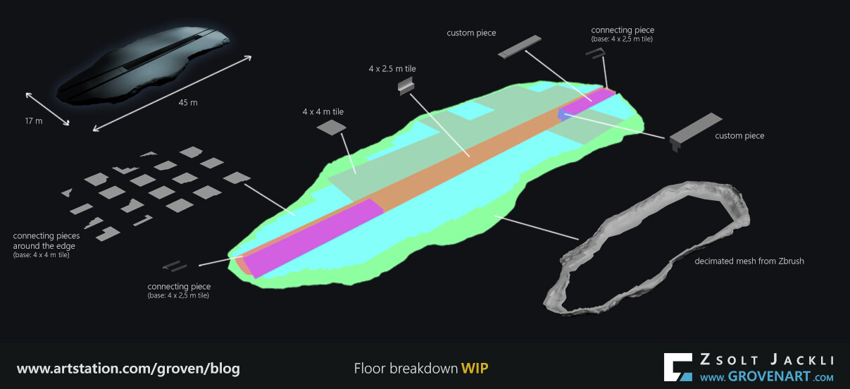
At this point an important question needs to be answered: If the whole UV on the first UV channel of a model does not fits into the 0-1 UV space but the texel density is this big, then what can I do to be able texture the assets properly? The method I used to answer this question is breaking the assets into pieces or making a modular kit out of them and assembling everything in the engine.
Let`s see examples how I made the low poly version of some of the assets :


These objects are grouped together in Unreal. Not only because it is easier to manage them, but in Unreal the Lightmass system has the tendency to bake different objects in different clusters. Different pieces gets different lighting causing lightseams and these should be avoided. By grouping the objects together Unreal will read the objects as one big object. Therefore the pieces used to build up the whole model will be rendered as one keeping their original lightmap density. As a result the bake is nice and clean without seams.
To group objects in Unreal without losing lightmap density creating a group with selected actors or placing the pieces in a blueprint could be a solution. To group actors just select all the objects you want to group together, press right click on them and select the group from the dropdown menu (default hotkey: Ctrl+F). Blueprints are really powerful but they have their limits. My experience is that placing more than 40 meshes in a blueprint can cause errors. For instance the assembled floor presented above made of 53 pieces all together. First I thought it was better to group the modular pieces together than using blueprint. But for some reason grouping actors did not solve the lightseam issue even if I deleted all the previously baked lightmaps and rebaked them. I created a blueprint but that gave an error for the casting shadows because the assembled floor was way too big. Luckily the floor the base of the whole diorama scene so it doesn`t have to cast shadow on anything. To solve this temporarily I disabled the cast shadow for each floor pieces in the blueprint. The Lightmass settings are related to this issue as well so I will do more tests to find the right solution.
Important to highlight that if you are aiming to group objects for light baking Merge actors can also be used but in this case better to avoid it if it is possible. As its name indicates it merges everything together. If I had used it for the floor it would have combined not only the meshes but also the 2nd UV channel of all the pieces into one UV reducing the lightmap density drastically. This would have been visible on the quality of the baked lighting of the object. To compensate this I should have doubled or more the lightmap resolution of the object which would have lead to longer baking times, bigger and increased number of lightmap files.  Its result still wouldn`t have looked good enough for such a big asset.

Basically this covers what I mean by "pushing vertices". This step can be really repetitive and it has more technical aspects than creative ones in the creation process but without it can not proceed. So must be done. The good side of it that your technical skills can really shine here and you can come up with new methods to speed up or simplify your work.


Stay safe and see you next time!

In Depot Project #01 - Beginning

Making Of / 24 December 2020

Hello everyone!
Recently I have started a project and today after some preparations I can start recording the process by writing this blog.
Apart from this, I have another goal in mind: To help fellow artists on their own journey. Being in this industry for 10 years I got help from many people many times and went through a lot while I tried to stay in the industry. This year is a hard year. But quite an interesting one for me. I held an online workshop, got questions about my workflow, got my very first interview with 80.lv (you can read it here: https://80.lv/articles/001agt-005cg-autumn-in-the-mountains-modular-hero-prop-vegetation/) and had inspiring conversations with other artists who are wiling to keep learning as me. These events made me think the time has come to give back to the community I am part of it.


About the project:
Actually the project mentioned above is not new. More like part of a series or with other words pushing a project always to the next level. You can see the Nohab train in my portfolio. This asset accompanied me on my journey in the game industry since its beginning. Thanks to this I got opportunities I couldn`t have had otherwise (for instance my model was used to create a mold for train shaped cakes). Many say instead of redo a piece after you finished it better to start a totally new one. I think there is no wrong or right approach regarding this. What really matters is what that piece means to you. In case of this train, I have a deep connection with it and in a sense it has been growing with me during these years. So in a way it represents how I grow as an artist. When I had that feeling it is time to open up the model again and update it I did it. Of course working on the same thing over and over again might be not really fun but for me what I can learn with it or how I can show off my skills matter more.
This time I decided to put the train into a small diorama. To create its own little environment. This is not my first attempt to accomplish this. What I am going to show now already went through many stages in the last couple of years. This is why it is good to record the progress this time. To see it from the beginning to its completion. So in the followings I am going to share with you how I approach such a project, how I think and try to solve the challenges along the way.


First steps:

When I work on  an environment after I have a rough idea what I want to make I define each phases of the project in a project tracking file. This helps me to follow the progress of the project and estimate how much time required for each phase. At the end I can compare how much time actually I needed to complete each phase. It is a good feedback to see how fast I can progress and where are my strengths and weaknesses.  Due to the complexity of such a project it is easy to overlook something. Therefore It also contains the list of assets I am going to create. In this file I document everything so I won`t miss anything.


 It depends on the project how many and what phases I need but here is my general approach for a project structure.

  1. Set up your goals
  2. Think about the story
  3. Collect references 
  4. Study tutorials if needed, analyze scenes made by others
  5. Create blockout
  6. First lighting pass + composition setup in game engine
  7. Refine blockout
  8. First texture pass, master material setup in game engine
  9. Second texture pass + Second lighting pass in game engine
  10. Creating and adding decals
  11. Post processing
  12. Making renders, videos
  13. Publication


1. Set up your goals:

This is the starting point: Defining the goals I want to reach.  Below you can see what I am aiming for:

  • Make a diorama with the train in Unreal Engine 4 with PBR workflow
  • Lighting the scene with baked lighting in Unreal Engine 4
  • Focus on storytelling, lighting and composition
  • Implement the new skills and techniques I learnt 
  • Write a blog about its progress
  • Enjoy the process! :)


2. Think about the story

This step is a must have. It works as a guideline how to reach your goal. Also adds a lot more to the environment itself.
Finding the way how to tell a story is difficult. If I just put assets together in a pack that does not really impress anybody. It does not really tell what I want to convey or express.
In the past couple of years this diorama project for the train came to my mind couple of times. The story I came up with is simple: The train is somewhere and can not leave that place for some reason. It has to wait so it can continue its journey. I gave some thoughts, did some sketches and among many ideas I picked two at the end. One of them was a scene inspired by the train scene in the Spirited Away by Ghibli Studios. I created a scene based on this but somehow it did not really work out. It did not really tell the story I wanted. The other idea was a scene where the train is in a depot waiting for the maintenance get done. I created this scene as well a long time ago and decided to use this for the project.


3. Collect references 

Because I have this diorama setting containing exterior and interior environment elements it was really important for me to pick the mood of the scene at this early stage. After checking references from photos and movies I decided to go for a night scene with a classical cold vs warm color setup. (Interior part is going to be the warm, exterior part is going to be the cold.) This creates a nice contrast between the two and helps to focus on the hero asset of the scene which is the train itself.
I come up with a list of assets which would enrich the story I want to tell. I look up each of every them and study them as many angle as possible to understand their shape language, volume and scale. 


4. Create blockout

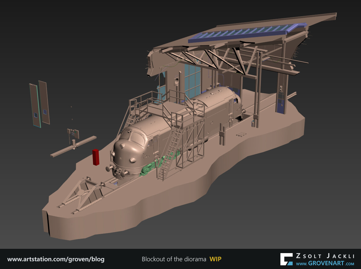
After analyzing the references I refer to my findings to recreate each asset in 3D with the correct size and scale. These models are having low polycount therefore easy to iterate them (The train model is already the final model that is why looks more polished than any other asset on the screenshot). I use a 1.8m high mesh (red box on the screenshot) as a reference for human scale. This way I can see the different assets in context and how they relate to each other in terms of size. I use different colors to make it easier to read the elements. 


Because I am going to bake the lighting in Unreal I need to UV the assets. Lightmap in Unreal has certain rules. One of them is it requires a second UV set. So these UVs for the lightmap will be different from the UVs I am going to use to texture the asset.
In this blockout phase if I used dynamic lighting in Unreal I would do a quick unwrap anyway because I can save time with it later. For instance the scaffold is quite a complex asset made of many boxes. If I unwrap one piece and using that to build the scaffold I can save time when I make its final UV. If I do not do the UVs now I have to unwrap later each of every piece and place them individually which can be really time-consuming. This approach comes handy also in case when you have to duplicate an asset many times (p.e.: bolt, stairsteps, etc.).


5. Study tutorials if needed, analyze scenes made by others

My experience is I keep learning new things as an artist does not matter how long I am in the industry. New technologies are getting implemented opening up new possibilities to explore. This is really exciting and inspiring part of the industry which pushes me to want to know more.
Tutorials are good to get started with the topic you would like to learn about and to get a sneak peek into other artists` workflow. It is good as a starting point compared to what was available 10 years ago when you had barely no access to such a resource. Still it does not give the solution to you for everything of course. In this digital era where we have easy access to online resources (Artstation, Gumroad, Unreal Marketplace, etc.) became available to get and study other artists` work. For me this is a real treasure chest. The main reason is I can see everything in context: materials, lighting, models of an environment at the same time and study the connection between them. Therefore I purchased Clinton Crumpler`s King Wash Laundromat scene on Unreal Marketplace. It contains everything I would like to study or get better at. Analyzing his work helped me understand what new technical challenges I have to face to achieve my goals. Understanding how certain things were made in his work helps me to find solution for most of the things in my work. Even though these proved to be a big help I am still doing a lot of tests and go through many try-and-error scenarios because my scene is different from his. But generally speaking testing things was always part of the creative process. This is the way to progress.


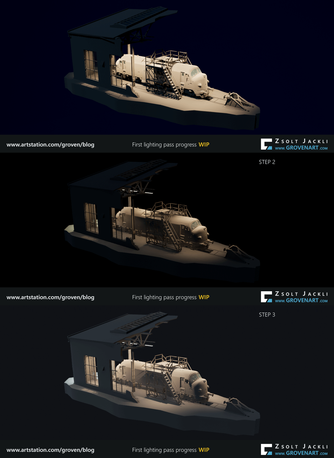
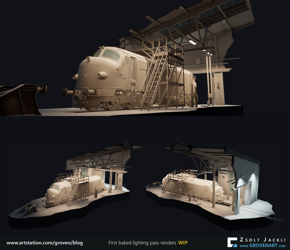
6. First lighting pass + composition setup in game engine

After all the preparation finally I can start assembling the scene in Unreal. Here is what I did:

  • I use a material with a mid gray value for the assets. For the glass I create a simplified glass material just to get the light through the object.
  • The train, folded door and the scaffold are not single meshes. They are broken into many pieces to get optimized UV size for the baked lightmap. This way I do not need to set a high resolution for the lightmap of an asset. Thanks to this the engine bakes faster and the size and number of the baked lightmaps are not too big/high. To keep them as a single object in the scene each of every them has a Blueprint containing their pieces.
  • I made a Blueprint for the cables as well. The reason is if I modify the position of an objects and have to adjust the cables as well I can do it easily in the engine. With this I can avoid going back and forth between 3DsMax and Unreal to fix the cables. I exposed a scale parameter in the Blueprint so I can create  cables with different scale (diameter) just adjusting this parameter.
  • I set up the scene for Lightmass baking. I added LightmassImportanceVolume and this time I experiment with Lightmass Portals too. I left most of the Lightmass settings by default. I changed only two things: Volumetric lightmap detail cell size set to 100  to increase the number of samples and the Num Indirect Lighting bounces set to 15 to increase the number of indirect lighting bounces. I came up with this values  for the test bakes while I was adjusting the settings of the lights. I did the bake with Lighting quality set to Preview.
  • I added a PostProcessVolume and set Bloom, Lens Flares, Image effect (vignette), Chromatic Aberration intensity to 0 and the Exposure Min , Max Brightness to 1.
  • Apart from all this, tweaking the lights and ExponentialHeightFog, adjusting placement of the assets, finding a good lightmap resolution and fixing lightmap issues ( caused by having not enough space between the UV shells) for each asset were the most time consuming in this phase.


Finding a good composition also requires a lot of testing. The main focus is the story I want to tell. Next to having a good lighting, adding and placing more props plus a well placed camera is crucial to get the composition right. The screenshots I show are still work in progress.


This is all for now.

Have a great holidays, Merry Xmas! 

Stay safe and see you next time!